Brand Design
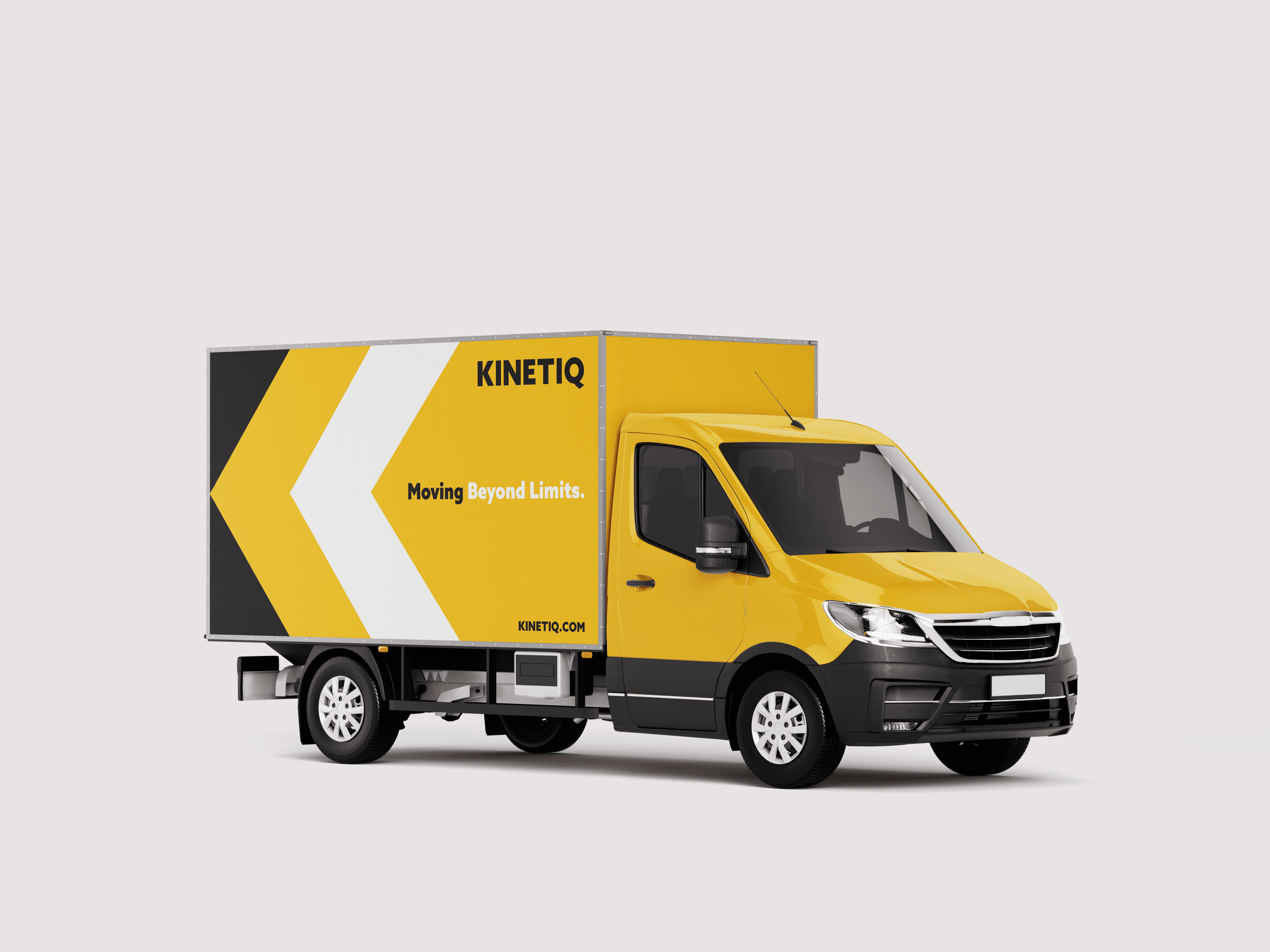
KINETIQ - Shipping Company Identity
Visual Strategy
I kept asking how to show movement without making the design feel too complex or heavy. I used clean geometric forms to keep everything structured and direct, and built the arrow into the “K” so motion becomes part of the letter itself. Yellow adds energy and visibility, while black and white keep the system stable and readable.